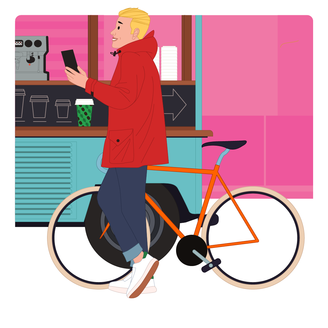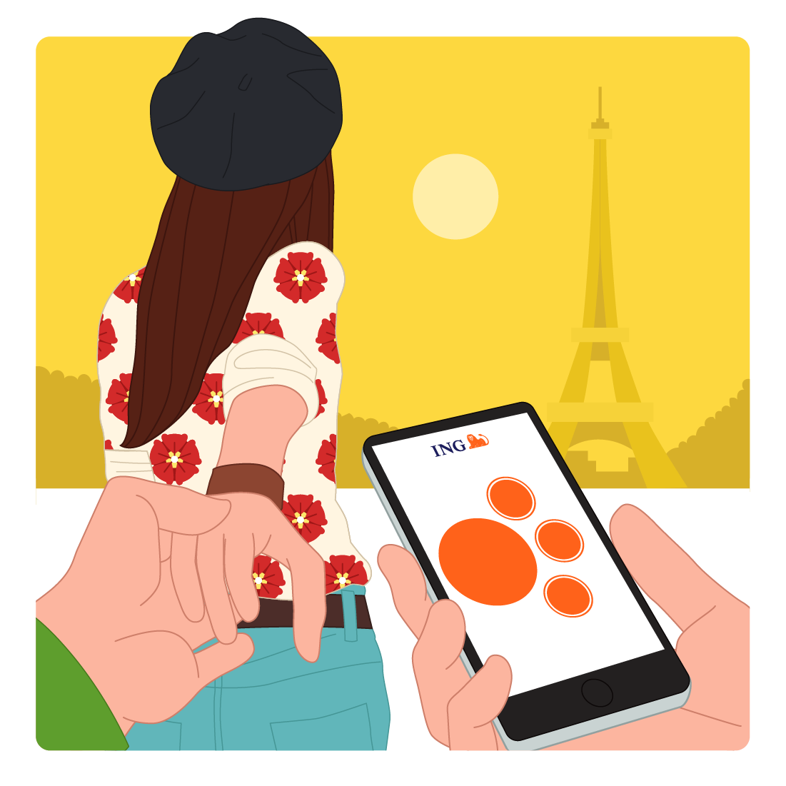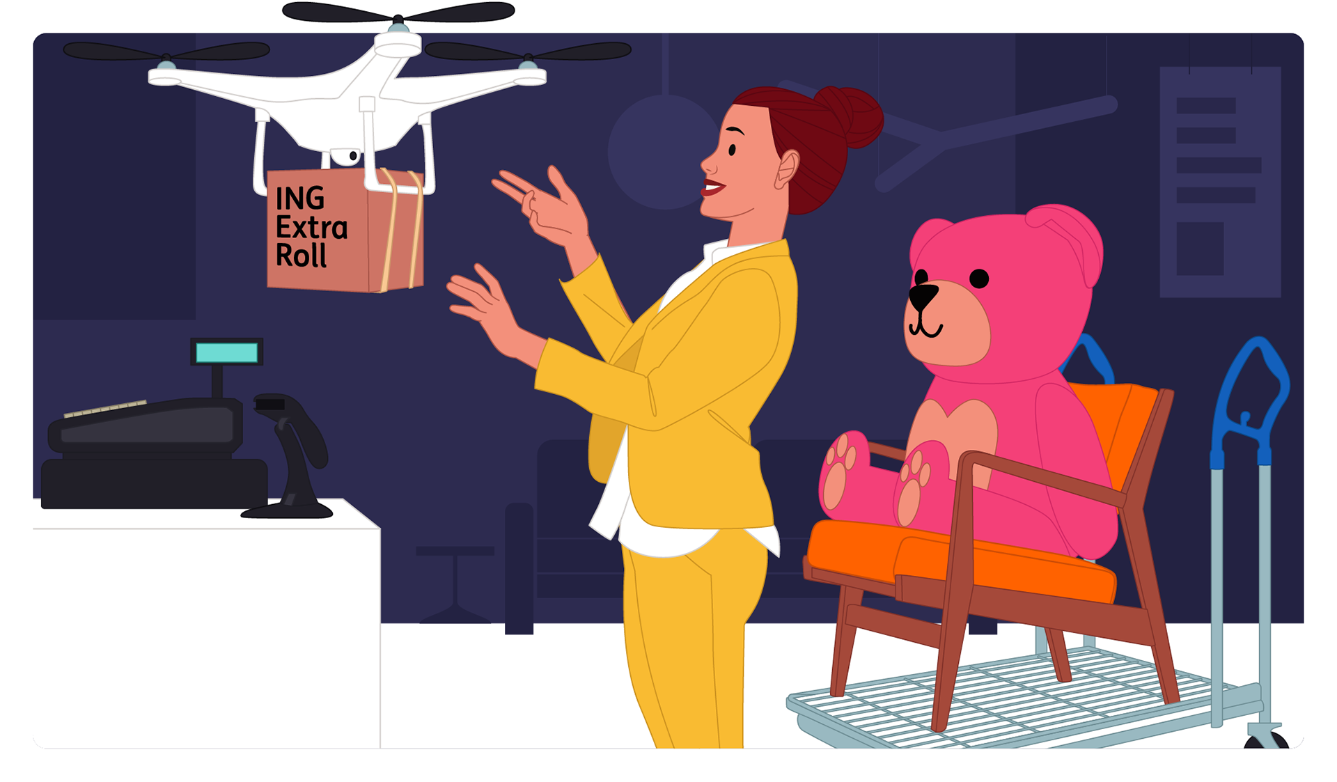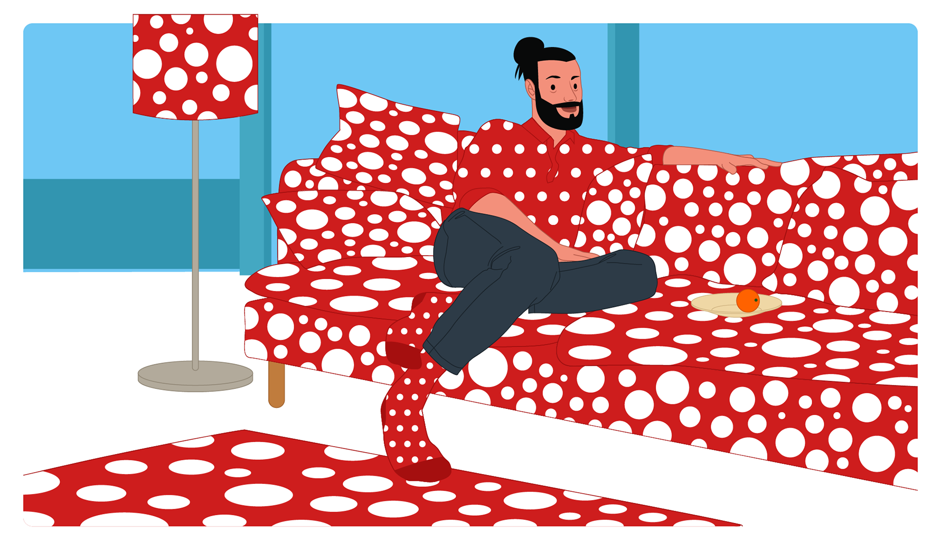
Over the years, the effectiveness of communication via animations has become very clear to ING. That's why they approached us to also develop a style for ING Global. For the global market, the emphasis had to shift slightly from emphasizing ING as a Dutch bank. That is why 'Global' has decided to omit the characteristic orange characters that we had developed for the Dutch market. And instead opt for more realistic ones. Another reason for this choice was that not all countries where ING is active are used to communicate via animation. That is why ING preferred to keep the animations closer to reality.